How to Make Buying Music Royalty Shares as Easy as Buying a T-shirt?
Minimizing Friction in Purchase with Clear Guidance and Smart Error Handling
Platform
iOS, Android mobile
Team
2 Designers, PM, UX Writer,
5 Devs (iOS, AOS, BE)
My role
Main Product Designer,
leading main flow design
Project Overview
At Musicow, a platform where users can buy shares of their favorite songs’ royalties, it was essential to make the purchase flow as intuitive as possible.
Since this was a new concept for most, I simplified the steps, designed clear error states, and focused the UI on the reward: the excitement of owning music and the royalty earnings to come.


Image created with Generative AI.
Due to NDA, some of the parts are blurred out or replaced by dummy texts and images.
Problems
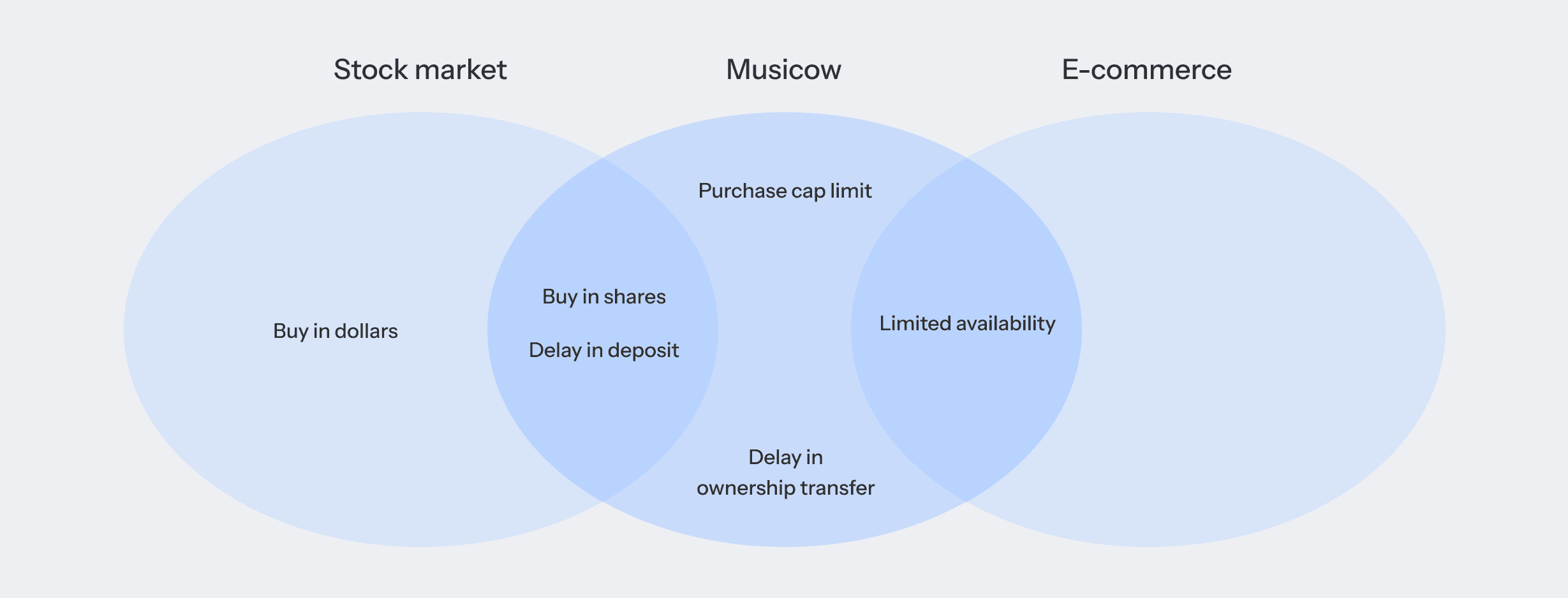
1. Limited Availability
Users buy in shares like a stock, but the quantity is limited.
2. Purchase Cap limitation
Users can only buy up to 25% of the total shares.
Users can’t buy in dollar amounts, but only in shares.
Just looking at how our purchase works, our platform sits between the Stock market and regular E-commerce.
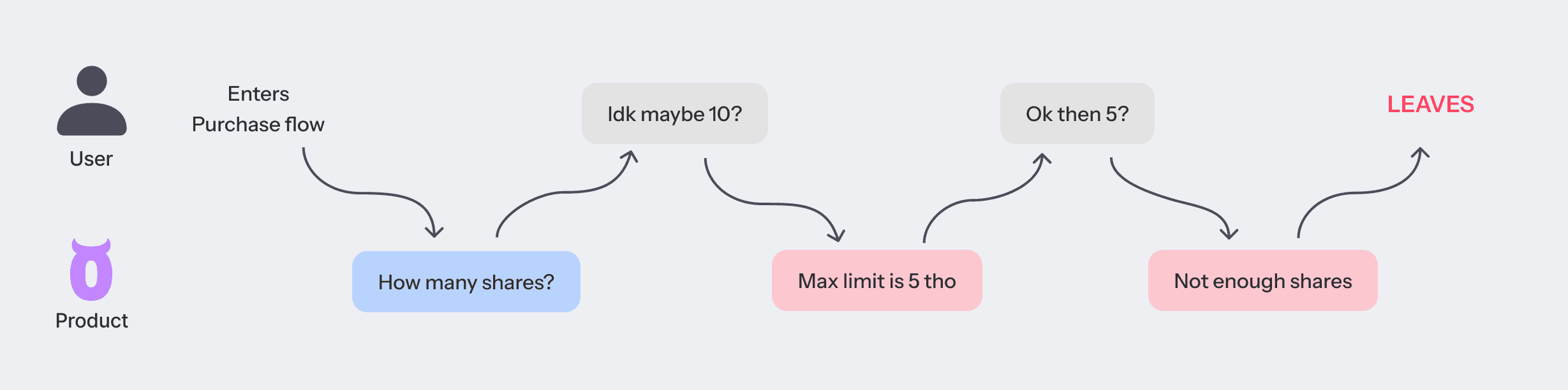
Journey Map
This is how the user journey would look like with our current problems:

Goals
N%
of the users who started finish
of average purchase completion time
Research
First, I researched how other companies handle their purchase flow, particularly in:
Stock market platforms: Overall flows and how they handle low balance
E-commerce platforms: Purchase restrictions like low quantity and max limit


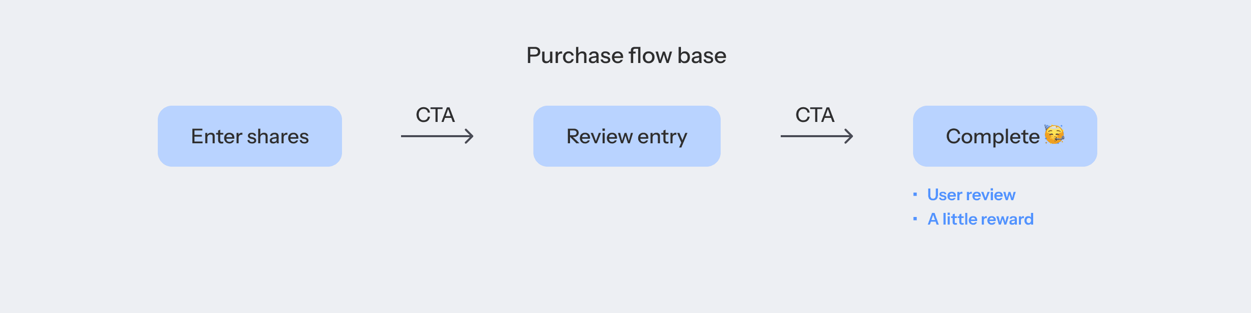
Rough Solution Sketch
I began by basing our purchase flow on common patterns found in trading apps to give users a familiar structure.

Then I listed all the elements that needed to be included in the purchase flow, and divided them into 4 categories:
Show at ‘Enter shares’
Show at ‘Review entry’
Show when 1st CTA is clicked
Show when 2nd CTA is clicked

And I came up with extra features that are not mandatory, but would help users go through this process: Quick buttons, User review, and A little reward to celebrate the purchase.
Since users are new to both this platform and this concept,
Allowing them to refer to how many shares other users buy
Letting them know how many shares we suggest to buy
was important to achieve our goal.
Initial design
Based on the definition of what we need in our purchase flow, I came up with this initial design.

User Testing
Purchasing music security is the most important part of our service, so I tried to receive feedback from every team early on.
I conducted the user testing with the initial screens above.

Feedback from Other Teams
Below is the summary of the interview findings:

Iterations
Based on the findings from user testing and further development of our design system and other screens, following iterations were made:
1. Alignment & Structure
a) Adopted left-alignment to ensure consistency across pages.
b) Reduced visual prominence of album art, preparing for scenarios where album art may be unavailable.

2. Quick buttons
a) Updated the buttons to the newly developed [Chip] component in our design system.
b) Slightly increased the preset share quantities, based on user testing results and discussions with the Business team.

3. Purchase completion and Collection Card
a) Added a purchase confirmation page with a checkmark animation to clearly signify the end of the purchase flow, addressing user feedback.
b) Increased the importance of the [Share] button to encourage users to share their cards.
c) Reduced the visual importance of album art on collection cards as well. Instead, introduced an element emphasizing the connection to the creator to highlight that the asset is being handed over directly from the creator.

Error Handling
Let me bring my initial flow back to identify potential error messages.

First, according to the devs, the system checks remaining_shares only when users reach the final CTA. Not being able to display ‘Sold out’ message from the first CTA, this message was removed.

And the PM told me that the max number users could buy was 10,000 shares regardless of the total shares.
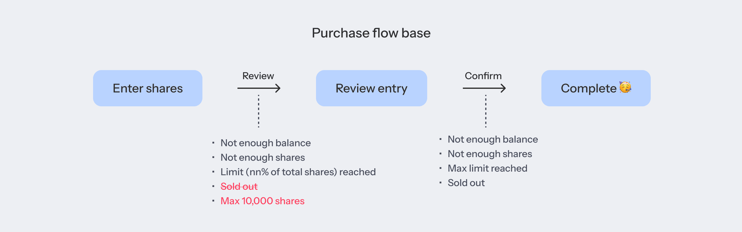
So far there were 4 + 4 = 8 error cases to design.
Design system for Error messages
Among the components already available in our design system, followings could be used to communicate errors.

Since our design system lacked explicit guidelines for error messaging, we took this opportunity to establish clear rules and update the guideline.
We classified them based on their severity as follows:

After thorough discussion with our team members, we agreed on the criteria for determining which errors would trigger each type of message.
Based on the rules above, I was able to choose the right format for each error cases. Below are two examples of using dialog, keyboard disable and toast.
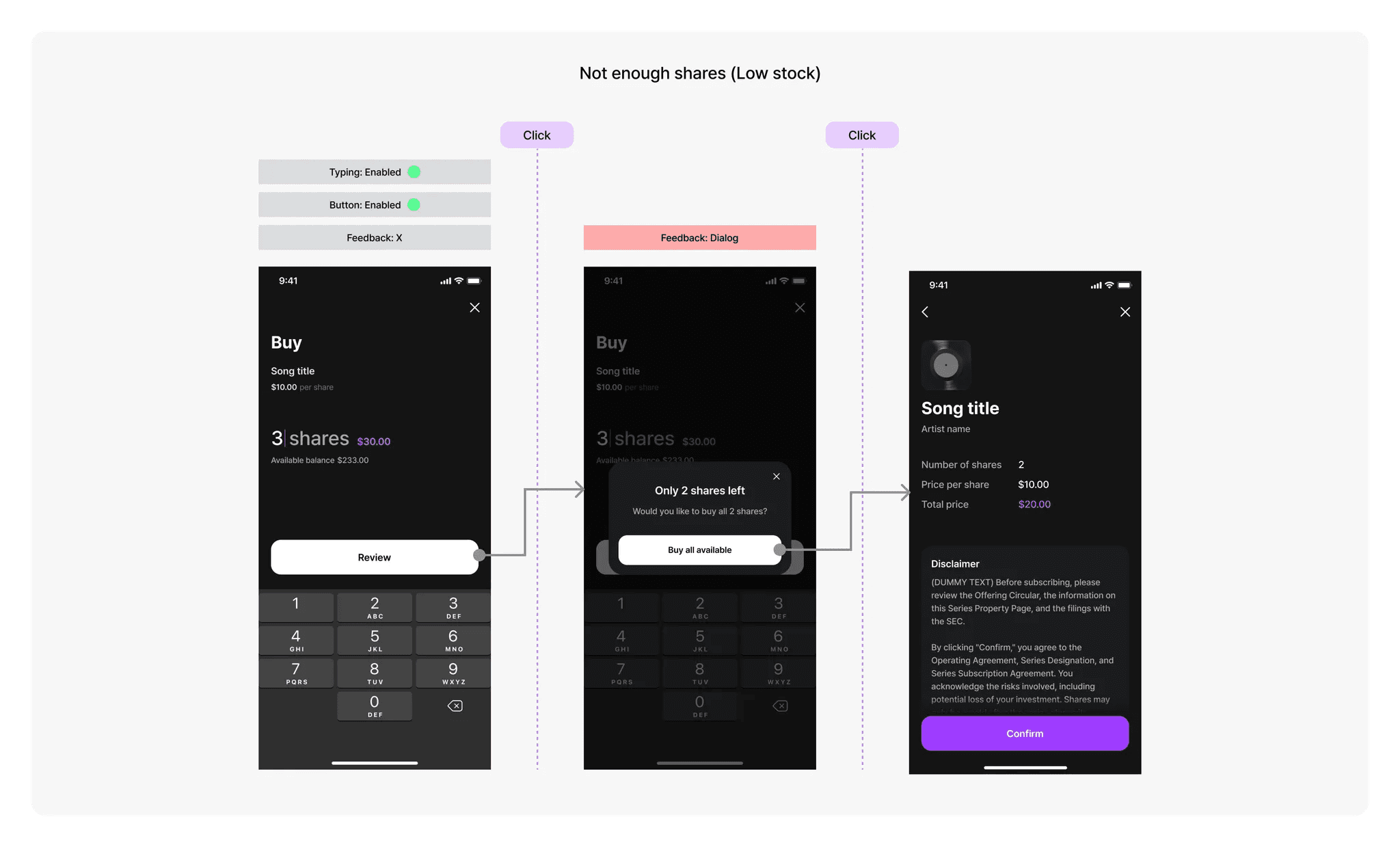
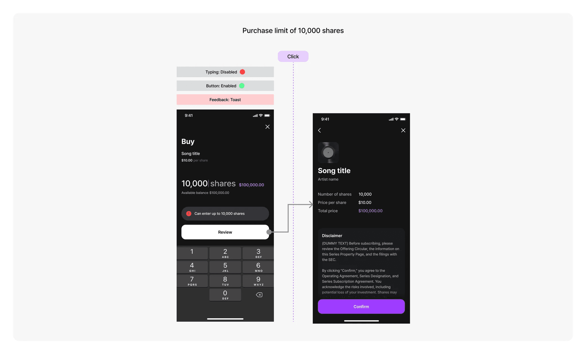
The messaging for dialogs and toasts was finalized in collaboration with our UX writer, ensuring that users are well-guided toward the most appropriate and simple action.

Edge cases for Error messages
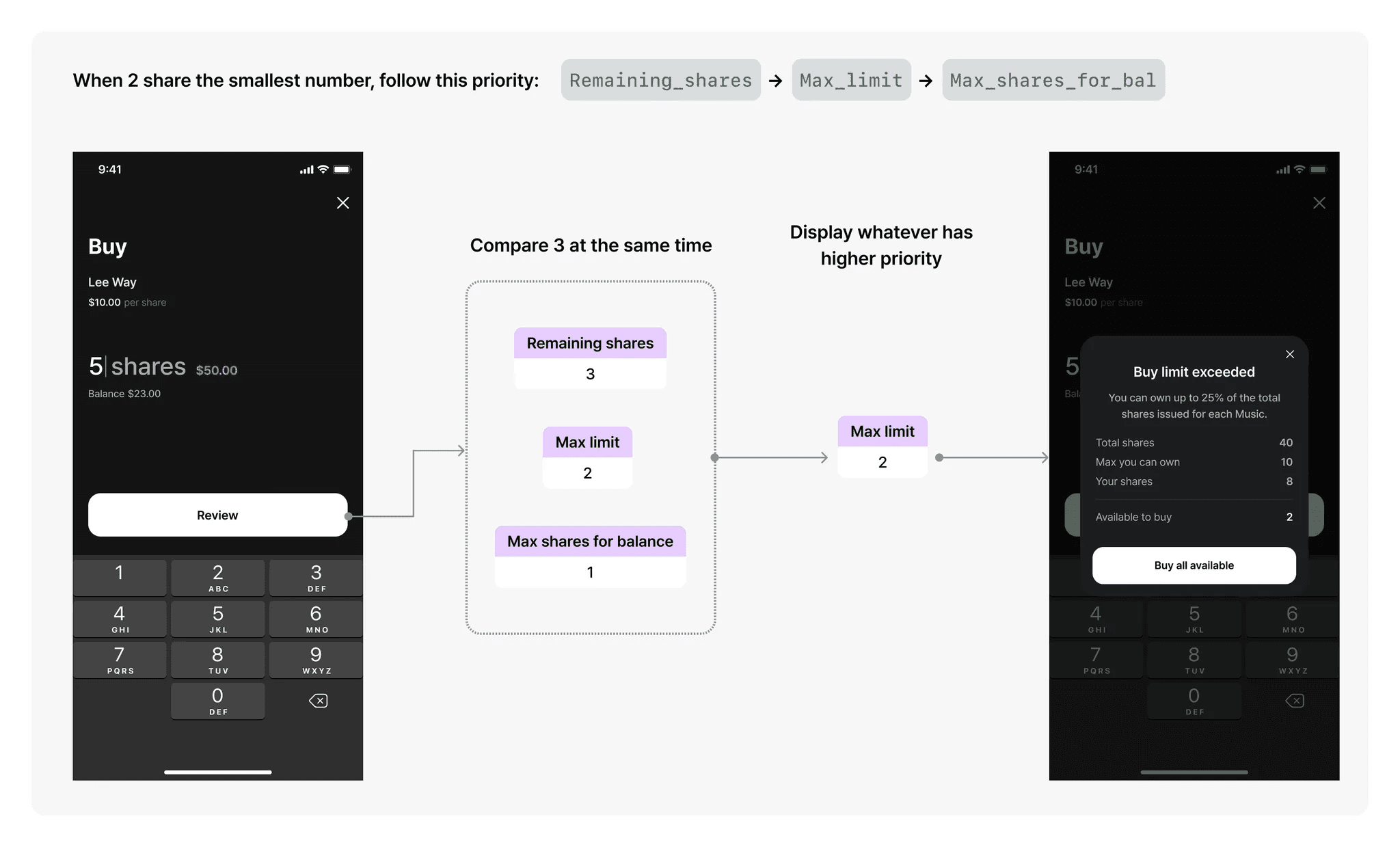
The biggest hardship was to figure out the priority and setting up the logic of sending the error messages so that users don’t have to encounter similar error messages over and over.
To tackle this, I worked closely with FE to learn their initial logic and come up with the most ideal solution.

The solution we came up to show only one error message was the following:

This finalizes the journey of purchase error cases.
Final Design
Below is the final design of our purchase flow.
Due to our tight timeline, the [Review] feature was scoped out by the dev team for the beta launch.
However, this will be implemented in our first update post-launch, anticipating that user reviews will support purchase decisions and boost user engagement.