How To Make Users Willingly Answer 21 Questions on Sign Up
Optimizing Sign up & KYC to Minimize Drop-Off Rate
Platform
iOS, Android mobile, Web (Hybrid)
Team
2 Designers, PM, UX Writer,
6 Devs (iOS, AOS, FE, BE)
My role
Main Product Designer,
leading main flow design
Project Overview
At Musicow, a platform where users can buy shares of their favorite songs’ royalties, the mandatory steps before purchasing were long, especially the sign-up requiring 21 questions.
I designed the onboarding experience from scratch, using micro-interactions, auto-advance, small rewards, and intervention triggers to make the process feel faster and more engaging.

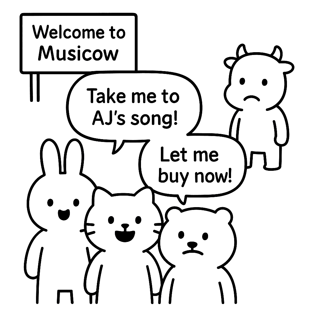
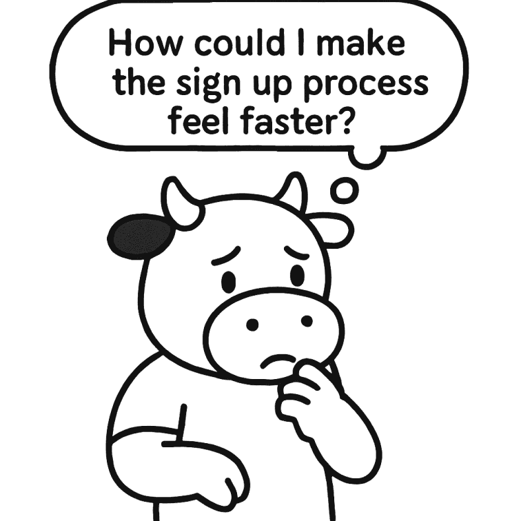

Image created with Generative AI.
Due to NDA, some of the parts are blurred out or replaced by dummy texts and images.
Problems
1. Strict Regulatory Reguirements
Due to KYC/AML compliance, all 21 questions must remain unchanged.
2. No Pre-Submission Validation
Since it requires costly fees per check, preventing errors upfront is crucial.
As a startup, requesting sensitive personal information may cause drop-offs.
Additional problems included tight timeline from design to development and minimal customer support.
What is KYC/AML?
Goals
N%
of the sign-up users to complete KYC
N%
of KYC Failure due to minor input errors
of average KYC completion time
Research
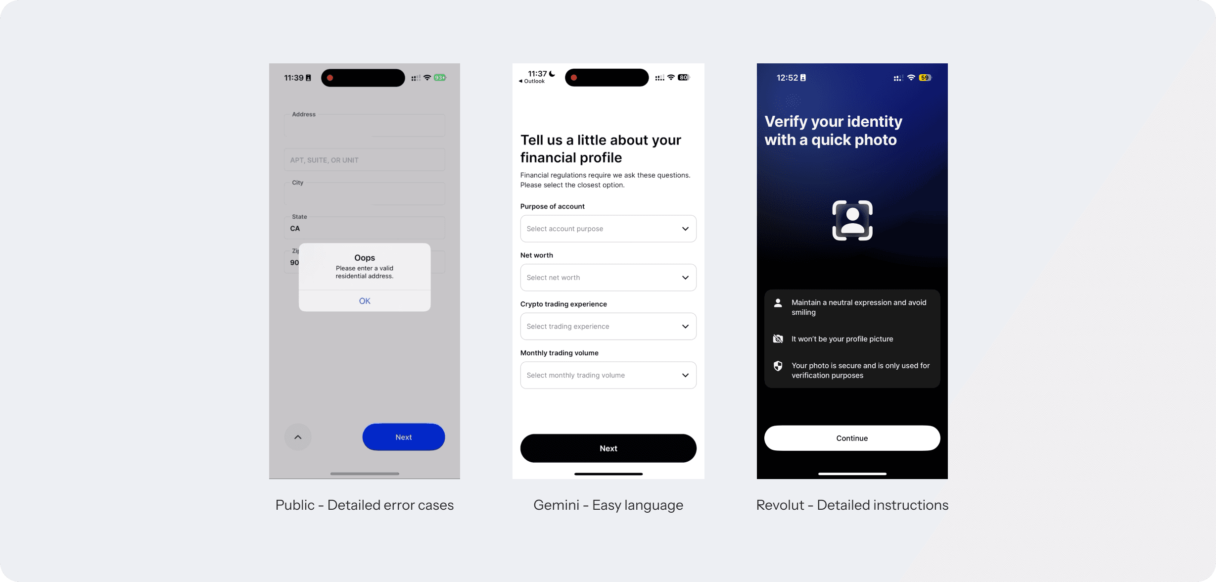
First, I researched how other companies structure their KYC flow: focusing on how many questions they ask, how many screens they have, and what are their strong points.
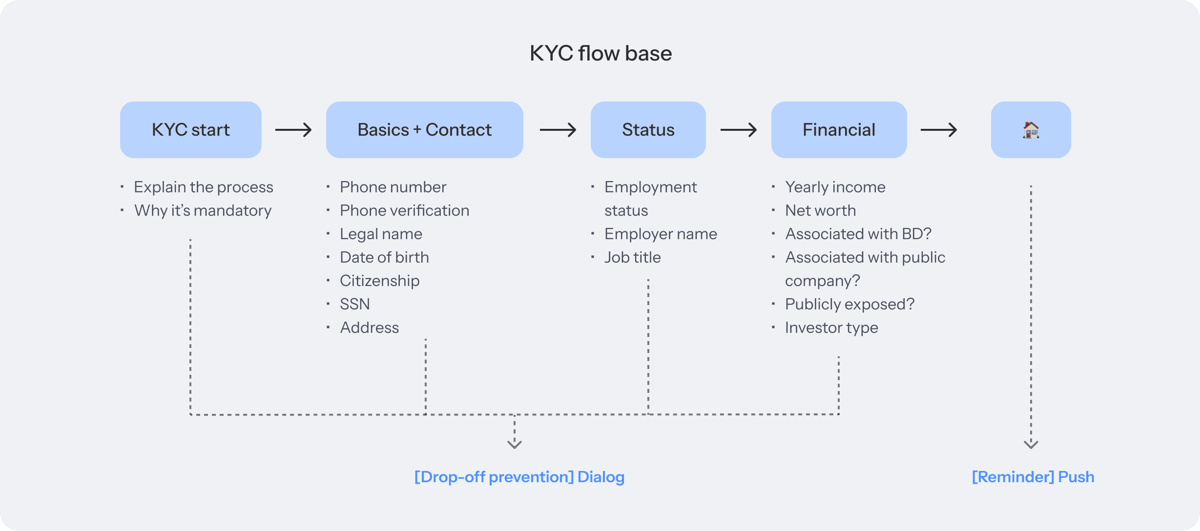
Since there are so many mandatory questions, it was important to group similar questions to form the most natural flow.
I was able to categorize the questions into 5 categories, and here’s how it looked like.

User Flow

Unlike our competitors that combine general sign-up and KYC (Identity Verification) into a single process, we decided to separate them.
🧐
Therefore, it was important to have features that
1. Prevent users from dropping off during KYC
2. Remind those who haven’t started/completed KYC inside the app
Early Design
Here are some of my early design choices based on the flow I created above.
1. Clear and detailed UX writing
Used friendly yet professional language to enhance clarity, reduce simple errors, and build trust.

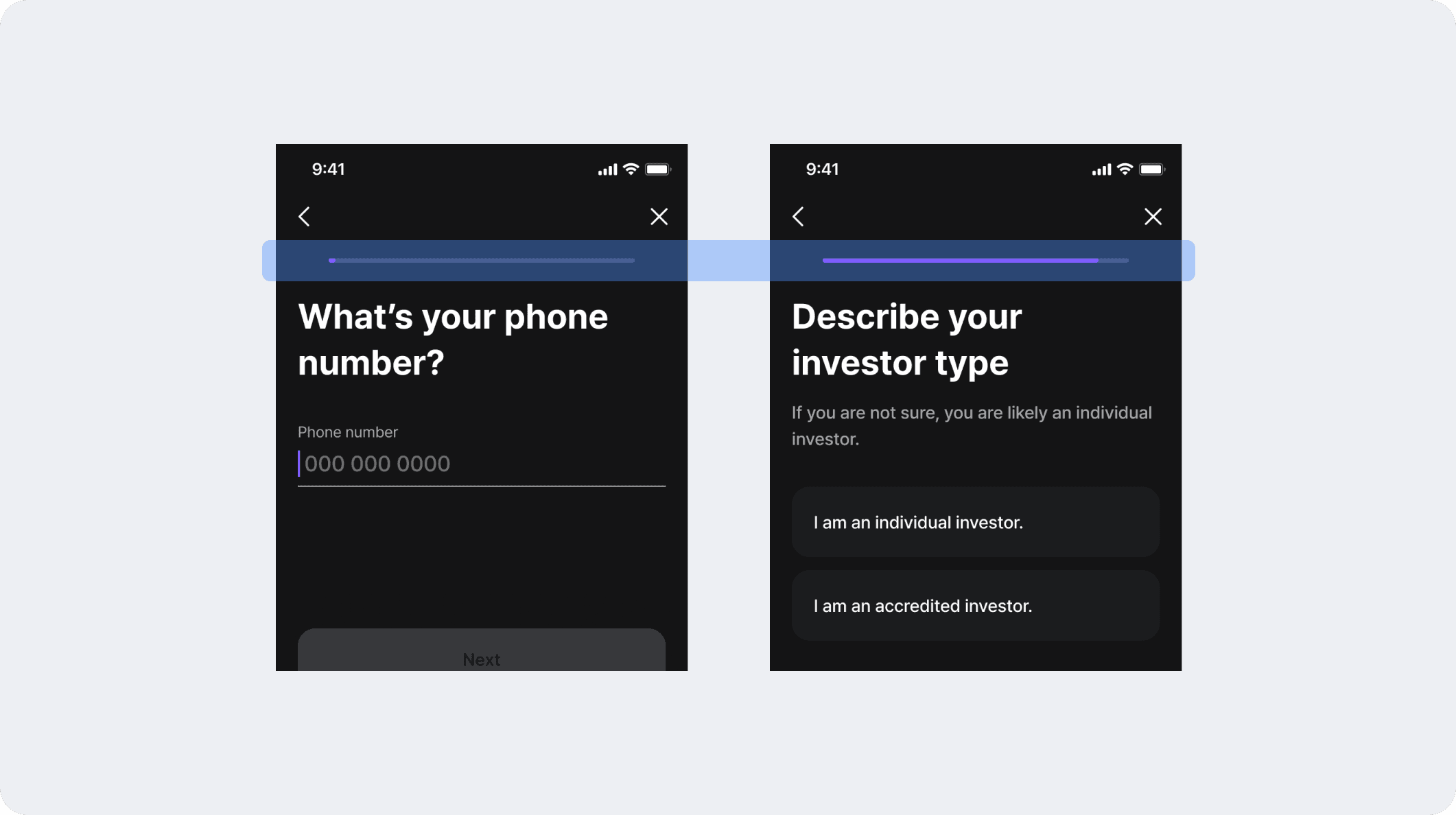
2. Adding a progress bar
Gave users an idea of how long the process will take to prevent drop-off due to uncertainty.
3. Merging steps
Combined some of the steps in one screen to make the process feel shorter.

4. Gradual transition into financial questions
Started with basic personal details before moving into financial questions.

Iterations
While I tried to reduce more steps, compliance requirements didn’t allow much.
Instead, the focus shifted to providing clear guidance and small rewards throughout the flow.
(Note: Users can’t save progress mid-way, making these more critical.)

1. Compensation and clear introduction
a) Added a celebratory animation after sign-up to create a clear transition into the KYC process and to reinforce brand identity.
b) Redesigned the intro screen and added light animations to clearly explain the process.

2. Click reduction through auto-advance & Progress bar pacing adjustments
a) Enabled automatic transition between fields, so the next field appears without extra taps.
b) Modified the progress bar so early steps advance more quickly, giving users a quick win and building momentum at the start.

Motion Tokens for Design system
We needed to come up with motion token for our design system, and we took a start with coming up with tokens for slide up/down for action sheet.
First, I had a look at Apple and Material design guide of their easing curves and durations, and applied to ours.
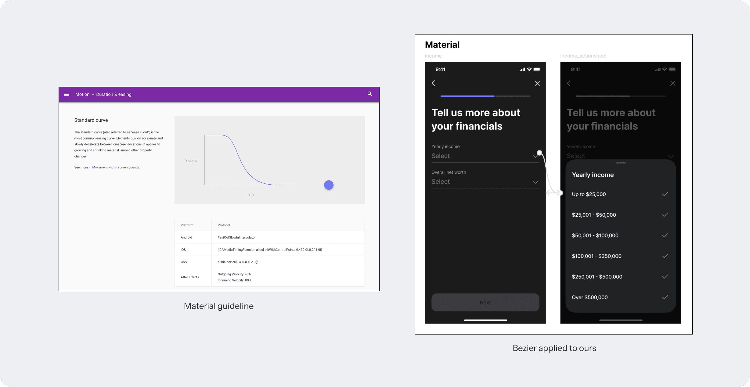
I also took reference of different apps where I thought matches the vibe of our app is aiming for, and used AI tool to explore possible options, and eventually come up with one.
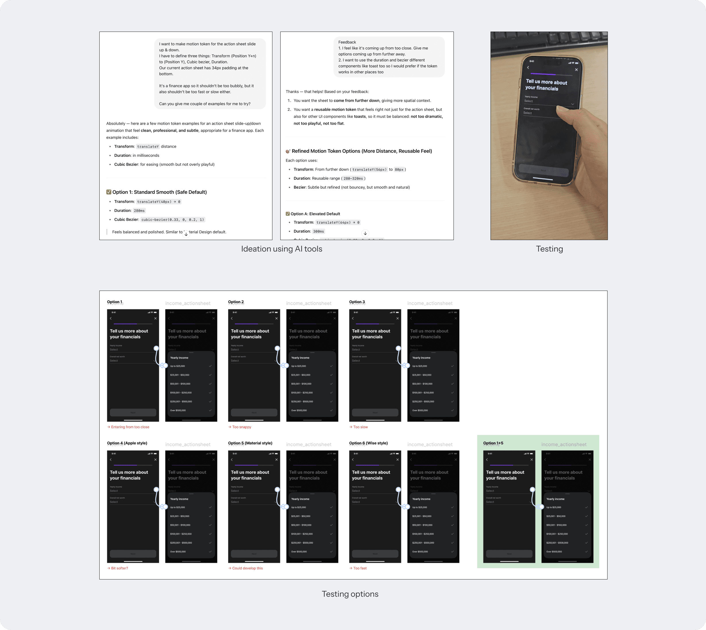
And with guidance from the senior designer, we came up with all the motion tokens for design system motion guidelines.


Implementing Intervention Triggers
Since KYC/AML approval is a mandatory step before making any purchase, dialog prompts during sign-up were not enough.
Users who skipped or abandoned the process needed more deliberate interventions to ensure completion.

To address this, I collaborated with the PM to define when and how to re-engage users through both push notifications and contextual blocks, preventing users from continuing certain actions without first completing it.
1. Push Notification Strategy
1) Triggers nn hours after account creation for users who haven’t completed KYC/AML.
2) Messaging designed to remind users of the benefits and urgency of completing verification (Written in collaboration with UX Writer).

2. Contextual Intervention Triggers
1) On [Buy] button tap: Re-displays the KYC start screen explaining that verification is required to make a purchase.
2) On visiting [Account/Profile] page: Highlights incomplete verification status and encourages users to finish the process.

Final Design
Below is the final design of our KYC/AML flow.